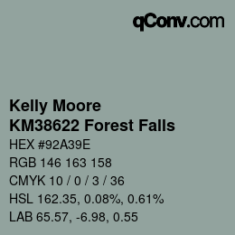
Information
close all
Complementary color
Complementary means first and foremost complementary. With color tones there is always a direct complementary color that is exactly opposite to the other.
With this color tone Kelly Moore - KM38622 Forest Falls it is the complementary color Kelly Moore - KM41673 Powderhorn Manor. Both colors form the strongest contrast to each other and are especially recommended for use in direct connection with each other.
If you display a text with its complementary color on a background with the displayed color, you will get a representation that is pleasant to the eyes and clearly too indistinguishable from each other. However, this is especially true for white, black and gray tones. With these, the contrasting colors are particularly natural, pleasant and common for our eyes.
Lighter colors
Exposures are based on the same hue and represent lighter versions of the current color Kelly Moore - KM38622 Forest Falls. Besides the border colors white and black, almost all colors have lighter versions that can be used optimally in web design
The following lighter shades match the Kelly Moore - KM38622 Forest Falls shade: Kelly Moore - KM38692 Paytons Car, Kelly Moore - KM38362 Raw Steel, Kelly Moore - KM38601 Sea Dreams, Kelly Moore - KM38591 Misty Harbor and Kelly Moore - KM3153-1 Phantom Lake
You can use them to modify buttons with mouse-over effects (called :hover in CSS) or to generate other color gradations like gradients.
Darker colors
Shades are based on the same hue and represent a darker version of the current color Kelly Moore - KM38622 Forest Falls. In addition to the border colors white and black, almost all colors have shades that can be used optimally in web design.
The following darker shades match the Kelly Moore - KM38622 Forest Falls shade: Kelly Moore - KM38622 Forest Falls, Kelly Moore - KM37972 Mirador, Kelly Moore - KM38383 Roman Stone, Kelly Moore - KM38153 Charcoal Shadow and Kelly Moore - AC2485 Bayou Mistery
Among other things, you can use them to modify buttons with mouse-over effects (called :hover in CSS) or generate other color gradations.
Warmer colors
Warmer colors are created when the hue is shifted towards red, orange and yellow. These colors convey warmth, energy and an inviting atmosphere.
The following warmer shades match the Kelly Moore - KM38622 Forest Falls shade: Kelly Moore - KM38622 Forest Falls, Kelly Moore - KM38622 Forest Falls, Kelly Moore - KM38692 Paytons Car, Kelly Moore - KM38692 Paytons Car and Kelly Moore - KM38692 Paytons Car
They are stimulating and dynamic and are often used to attract attention or create a friendly and lively mood. An example of this transition is a shift from a cool blue through purple to red and orange.
Colder colors
Colder colors are created by shifting the hue towards green, blue and violet.
The following colder shades match the Kelly Moore - KM38622 Forest Falls shade: Kelly Moore - KM38622 Forest Falls, Kelly Moore - KM38622 Forest Falls, Kelly Moore - KM38622 Forest Falls, Kelly Moore - KM3094-2 Tiannas Eyes and Kelly Moore - KM3094-2 Tiannas Eyes
These colors have a cool, calming effect and create distance. They are often used to convey a sense of calm, freshness and stability. A classic example of this color range is a gradient from yellow to green to a deep blue or violet, reminiscent of water and sky.
Richer colors
Richer colors are created by increasing the saturation, which makes the colors appear more intense, brighter and stronger. A color with high saturation is more eye-catching and appears more vibrant and powerful. This effect can be used to emphasize important elements or to create a vibrant design.
The Kelly Moore - KM38622 Forest Falls shade matches the following richer shades: Kelly Moore - KM38622 Forest Falls, Kelly Moore - KM32782 Gardening Girl, Kelly Moore - KM32702 Jolt of Jade, Kelly Moore - KM32702 Jolt of Jade and Kelly Moore - KM32462 Alexandra Valley
An example is the development from a pale pink to a strong and bright red.
Paler colors
Less saturated colors are created by reducing the saturation, which makes the colors more muted, subtle and pastel-like. As the saturation is reduced further, they become closer and closer to a shade of gray. These colors appear calmer and more elegant and are suitable for a restrained and harmonious design.
The following paler shades match the Kelly Moore - KM38622 Forest Falls shade: Kelly Moore - KM38622 Forest Falls, Kelly Moore - KM39332 Granite Cliff, Kelly Moore - KM41582 Merry Meredith, Kelly Moore - KM37273 Raisa and Kelly Moore - KM36793 Lady Love
An example is the change of a strong blue to a subdued grey-blue or almost neutral shade.
Analogue colors
The analog color scheme uses colors that are directly adjacent to each other in the color wheel. They usually fit together well and result in a calm and comfortable design.
The following analogous shades match the Kelly Moore - KM38622 Forest Falls shade: Kelly Moore - KM38692 Paytons Car, Kelly Moore - KM38622 Forest Falls, Kelly Moore - KM38622 Forest Falls, Kelly Moore - KM38622 Forest Falls and Kelly Moore - KM38622 Forest Falls
Analog color schemes are often found in nature. They are harmonious and pleasant to the eye. It is important that they have enough contrast. Choose one color to dominate and a second to support. The third color is used (together with black, white or grey) as an accent
Monochromatic colors
The monochromatic color scheme uses colors that are on the same wavelength. They usually fit together very well and result in a pleasant and evenly colored design.
The following monochrome shades match the Kelly Moore - KM38622 Forest Falls shade: Kelly Moore - KM38553 Canton Jade, Kelly Moore - KM37972 Mirador, Kelly Moore - KM38622 Forest Falls, Kelly Moore - Flat and Kelly Moore - KM38511 Quiet Cove
Monochromatic color schemes are often found in nature. They are harmonious and calm to the eye
Partial complementary colors
The partial complementary color scheme is a variation of the complementary color scheme. In addition to the base color, the two colors adjacent to the complement are used.
The following split-complementary shades match the Kelly Moore - KM38622 Forest Falls shade: Kelly Moore - KM38622 Forest Falls, Kelly Moore - KM3046-2 Garden Beauty and Kelly Moore - KM39332 Granite Cliff
This color scheme has the same strong visual contrast as the complementary color scheme, but is not as contrasting as the direct complementary color. The partial complementary color scheme is a good choice for designs. These colors usually complement each other very well.
Triadic colors
A triadic color scheme uses colors evenly spaced around the color wheel. Triadic color harmonies are usually quite vivid, even if pale or unsaturated colors are used.
The following triaden shades match the Kelly Moore - KM38622 Forest Falls shade: Kelly Moore - KM38622 Forest Falls, Kelly Moore - KM3046-2 Garden Beauty and Kelly Moore - KM39332 Granite Cliff
The colors should be well chosen to achieve triadic harmony. Let one color dominate and use the other two as accent colors.
Rectangular (tetradic) colors
The rectangular or tetradish color scheme uses four colors arranged in two complementary pairs. This rich color scheme offers many variation possibilities.
The following tetraden shades match the Kelly Moore - KM38622 Forest Falls shade: Kelly Moore - KM38622 Forest Falls, Kelly Moore - KM3046-2 Garden Beauty, Kelly Moore - KM39332 Granite Cliff and Kelly Moore - KM39332 Granite Cliff
It works best if you let one of these colors dominate. You should also pay attention to the balance between warm and cold colors in the design
Square colors
The square color scheme is similar to the rectangular color scheme, with all four colors evenly distributed around the color circle. The square color scheme works best when one color dominates.
The following squaren shades match the Kelly Moore - KM38622 Forest Falls shade: Kelly Moore - KM38622 Forest Falls, Kelly Moore - KM3046-2 Garden Beauty, Kelly Moore - KM39332 Granite Cliff and Kelly Moore - KM38932 Pineview
Again, pay attention to the balance between warm and cold colors in the design.
Note
Colors are displayed differently on each device. Please note that the colors do not always match 100%. Differences can occur when real colors are processed. We recommend a comparison of the real colors. We do not assume any liability.
Display options
Primary color
HSL 162.35, 0.08%, 0.61%
LAB 65.57, -6.98, 0.55
Complementary color
HSL 8.57, 0.1%, 0.41%
LAB 43.17, 6.69, 4.38
Lighter colors
HSL 120, 0.06%, 0.61%
LAB 65.1, -6.04, 4.38
HSL 160, 0.04%, 0.68%
LAB 71.32, -2.48, 0.28
HSL 164, 0.12%, 0.75%
LAB 79.39, -5.86, 0.23
HSL 161.54, 0.13%, 0.81%
LAB 83.85, -5.13, 0.45
HSL 184, 0.27%, 0.89%
LAB 91.71, -4.44, -2.09
Darker colors
HSL 162.35, 0.08%, 0.61%
LAB 65.57, -6.98, 0.55
HSL 199.09, 0.1%, 0.55%
LAB 58.83, -3.86, -5.54
HSL 172.5, 0.03%, 0.46%
LAB 50.54, -3.19, -0.49
HSL 200, 0.03%, 0.39%
LAB 42.5, -1.12, -1.67
HSL 144, 0.09%, 0.33%
LAB 37.58, -7.82, 3.24
Warmer colors
HSL 162.35, 0.08%, 0.61%
LAB 65.57, -6.98, 0.55
HSL 120, 0.06%, 0.61%
LAB 65.1, -6.04, 4.38
Colder colors
HSL 162.35, 0.08%, 0.61%
LAB 65.57, -6.98, 0.55
HSL 219.23, 0.13%, 0.61%
LAB 62.26, 0.38, -9.99
Richer colors
HSL 162.35, 0.08%, 0.61%
LAB 65.57, -6.98, 0.55
HSL 153.19, 0.23%, 0.61%
LAB 68.82, -20.1, 5.69
HSL 162.07, 0.47%, 0.63%
LAB 76.54, -32.35, 4.76
HSL 173.45, 0.54%, 0.57%
LAB 75.73, -36.37, -3.56
Paler colors
HSL 162.35, 0.08%, 0.61%
LAB 65.57, -6.98, 0.55
HSL 33.33, 0.09%, 0.61%
LAB 64.76, 1.13, 6.27
HSL 346.36, 0.23%, 0.63%
LAB 62.26, 18.27, 1.18
HSL 329.59, 0.35%, 0.59%
LAB 56.54, 33.94, -7.78
HSL 350.89, 0.68%, 0.68%
LAB 62.59, 45, 10.96
Analogue colors
HSL 120, 0.06%, 0.61%
LAB 65.1, -6.04, 4.38
HSL 162.35, 0.08%, 0.61%
LAB 65.57, -6.98, 0.55
Monochromatic colors
HSL 180, 0.05%, 0.43%
LAB 47.55, -4.11, -1.42
HSL 199.09, 0.1%, 0.55%
LAB 58.83, -3.86, -5.54
HSL 162.35, 0.08%, 0.61%
LAB 65.57, -6.98, 0.55
HSL 210, 0.06%, 0.69%
LAB 71.22, -0.78, -3.17
HSL 166.67, 0.07%, 0.76%
LAB 79.51, -3.45, -0.08
Partial complementary colors
HSL 162.35, 0.08%, 0.61%
LAB 65.57, -6.98, 0.55
HSL 253.85, 0.06%, 0.6%
LAB 61.18, 3.68, -6.45
HSL 33.33, 0.09%, 0.61%
LAB 64.76, 1.13, 6.27
Triadic colors
HSL 162.35, 0.08%, 0.61%
LAB 65.57, -6.98, 0.55
HSL 253.85, 0.06%, 0.6%
LAB 61.18, 3.68, -6.45
HSL 33.33, 0.09%, 0.61%
LAB 64.76, 1.13, 6.27
Rectangular (tetradic) colors
HSL 162.35, 0.08%, 0.61%
LAB 65.57, -6.98, 0.55
HSL 253.85, 0.06%, 0.6%
LAB 61.18, 3.68, -6.45
HSL 33.33, 0.09%, 0.61%
LAB 64.76, 1.13, 6.27
Square colors
HSL 162.35, 0.08%, 0.61%
LAB 65.57, -6.98, 0.55
HSL 253.85, 0.06%, 0.6%
LAB 61.18, 3.68, -6.45
HSL 33.33, 0.09%, 0.61%
LAB 64.76, 1.13, 6.27
HSL 70, 0.09%, 0.63%
LAB 68.55, -4.34, 8.92
Description
Bright color: high color values create a bright impression.
The breakdown of the color into the RGB color system: of 255 maximum color components, 146 red, 163 green and 158 blue.
The mixing ratio of these colors results in the displayed hue in the middle of the overlaps.
In the illustration you can see how the color is composed of the three components: red (top),green (bottom right) and blue (bottom left). In the middle you can see the result color.
In the CMYK color system the color is composed as follows: In this color tone, out of 100 maximum color components, 10 cyan, none magenta, 3 yellow and 36 key.
The mixing ratio of these colors results in the displayed hue in the middle of the overlaps.
In the diagram you can see how the color is composed of the four components cyan (top left),magenta (top right),yellow (bottom right) and black or key (bottom left). In the middle you can see the result color.
Verification of their color palette as a manufacturer!
Provide designers and agencies with accurate color values.
Popular conversions
RGB to HEX
convert from RGB red green blue to #RRGGBB
RGB to CMYK
convert from RGB red green blue to CMYK cyan / magenta / yellow / black
RGB to RAL®
convert from RGB red green blue to RAL®-number (RAL 0000)
RGB to HKS®
convert from RGB red green blue to HKS®-number (HKS 00)
RGB to PANTONE®
convert from RGB red green blue to Pantone®-number (Pantone 0000)
RGB to Sherwin Williams®
convert from RGB red green blue to Sherwin Williams®-number (SW 0000)
RGB to NCS®
convert from RGB red green blue to NCS-number (S0000-X00X)
RGBA to HEX
convert from RGBA red green blue transparency to #RRGGBB
RGBA to CMYK
convert from RGBA red green blue transparency to CMYK cyan / magenta / yellow / black
RGBA to RAL®
convert from RGBA red green blue transparency to RAL®-number (RAL 0000)
RGBA to HKS®
convert from RGBA red green blue transparency to HKS®-number (HKS 00)
RGBA to PANTONE®
convert from RGBA red green blue transparency to Pantone®-number (Pantone 0000)
RGBA to Sherwin Williams®
convert from RGBA red green blue transparency to Sherwin Williams®-number (SW 0000)
RGBA to NCS®
convert from RGBA red green blue transparency to NCS-number (S0000-X00X)
CMYK to HEX
convert from CMYK cyan / magenta / yellow / black to #RRGGBB
CMYK to RGB
convert from CMYK cyan / magenta / yellow / black to RGB red green blue
CMYK to RGBA
convert from CMYK cyan / magenta / yellow / black to RGBA red green blue transparency
CMYK to RAL®
convert from CMYK cyan / magenta / yellow / black to RAL®-number (RAL 0000)
CMYK to HKS®
convert from CMYK cyan / magenta / yellow / black to HKS®-number (HKS 00)
CMYK to PANTONE®
convert from CMYK cyan / magenta / yellow / black to Pantone®-number (Pantone 0000)
CMYK to Sherwin Williams®
convert from CMYK cyan / magenta / yellow / black to Sherwin Williams®-number (SW 0000)
CMYK to NCS®
convert from CMYK cyan / magenta / yellow / black to NCS-number (S0000-X00X)
HEX to RGB
convert from #RRGGBB to RGB red green blue
HEX to RGBA
convert from #RRGGBB to RGBA red green blue transparency
HEX to CMYK
convert from #RRGGBB to CMYK cyan / magenta / yellow / black
HEX to RAL®
convert from #RRGGBB to RAL®-number (RAL 0000)
HEX to HKS®
convert from #RRGGBB to HKS®-number (HKS 00)
HEX to PANTONE®
convert from #RRGGBB to Pantone®-number (Pantone 0000)
HEX to Sherwin Williams®
convert from #RRGGBB to Sherwin Williams®-number (SW 0000)
HEX to NCS®
convert from #RRGGBB to NCS-number (S0000-X00X)
RAL® to RGB
convert from RAL®-number (RAL 0000) to RGB red green blue
RAL® to RGBA
convert from RAL®-number (RAL 0000) to RGBA red green blue transparency
RAL® to CMYK
convert from RAL®-number (RAL 0000) to CMYK cyan / magenta / yellow / black
RAL® to HEX
convert from RAL®-number (RAL 0000) to #RRGGBB
RAL® to HKS®
convert from RAL®-number (RAL 0000) to HKS®-number (HKS 00)
RAL® to PANTONE®
convert from RAL®-number (RAL 0000) to Pantone®-number (Pantone 0000)
RAL® to Sherwin Williams®
convert from RAL®-number (RAL 0000) to Sherwin Williams®-number (SW 0000)
RAL® to NCS®
convert from RAL®-number (RAL 0000) to NCS-number (S0000-X00X)
HKS® to RGB
convert from HKS®-number (HKS 00) to RGB red green blue
HKS® to RGBA
convert from HKS®-number (HKS 00) to RGBA red green blue transparency
HKS® to CMYK
convert from HKS®-number (HKS 00) to CMYK cyan / magenta / yellow / black
HKS® to HEX
convert from HKS®-number (HKS 00) to #RRGGBB
HKS® to RAL®
convert from HKS®-number (HKS 00) to RAL®-number (RAL 0000)
HKS® to PANTONE®
convert from HKS®-number (HKS 00) to Pantone®-number (Pantone 0000)
HKS® to Sherwin Williams®
convert from HKS®-number (HKS 00) to Sherwin Williams®-number (SW 0000)
HKS® to NCS®
convert from HKS®-number (HKS 00) to NCS-number (S0000-X00X)
PANTONE® to RGB
convert from Pantone®-number (Pantone 0000) to RGB red green blue
PANTONE® to RGBA
convert from Pantone®-number (Pantone 0000) to RGBA red green blue transparency
PANTONE® to CMYK
convert from Pantone®-number (Pantone 0000) to CMYK cyan / magenta / yellow / black
PANTONE® to HEX
convert from Pantone®-number (Pantone 0000) to #RRGGBB
PANTONE® to RAL®
convert from Pantone®-number (Pantone 0000) to RAL®-number (RAL 0000)
PANTONE® to HKS®
convert from Pantone®-number (Pantone 0000) to HKS®-number (HKS 00)
PANTONE® to Sherwin Williams®
convert from Pantone®-number (Pantone 0000) to Sherwin Williams®-number (SW 0000)
PANTONE® to NCS®
convert from Pantone®-number (Pantone 0000) to NCS-number (S0000-X00X)
Sherwin Williams® to RGB
convert from Sherwin Williams®-number (SW 0000) to RGB red green blue
Sherwin Williams® to RGBA
convert from Sherwin Williams®-number (SW 0000) to RGBA red green blue transparency
Sherwin Williams® to CMYK
convert from Sherwin Williams®-number (SW 0000) to CMYK cyan / magenta / yellow / black
Sherwin Williams® to HEX
convert from Sherwin Williams®-number (SW 0000) to #RRGGBB
Sherwin Williams® to RAL®
convert from Sherwin Williams®-number (SW 0000) to RAL®-number (RAL 0000)
Sherwin Williams® to HKS®
convert from Sherwin Williams®-number (SW 0000) to HKS®-number (HKS 00)
Sherwin Williams® to PANTONE®
convert from Sherwin Williams®-number (SW 0000) to Pantone®-number (Pantone 0000)